Single Malt is a multi-award winning brand consultancy & design studio based in the picturesque village of Kirkby Lonsdale. We work collaboratively to help our clients achieve results with creativity driven by passion & courage across both print and digital. Our process is built upon the importance of understanding your business & building you a brand that you will love.
Lancaster based R&B Estate Agents came to us for a bit of help with offline design and marketing work. After meeting with the R&B team and hearing their story, we realised that we could help them in a more significant way.
The Estate Agents had built up a reputation for offering an independent professional service in the local market and offered exceptional customer experience. However, their dated brand was not portraying their excellence and was starting to cause the business problems. So we set out conducting a brand audit in order to develop an identity that captures R&B Estate Agent’s heritage and expertise.
The objective was to create a brand identity and website that would change the audience’s perception of R&B Estate Agents to reflect their expertise, care and exceptional service.
We worked closely with the R&B team to understand what the brand stands for. We quickly realised that the business’s brand purpose is “to challenge the perceptions of the industry with the R&B personal touch.”

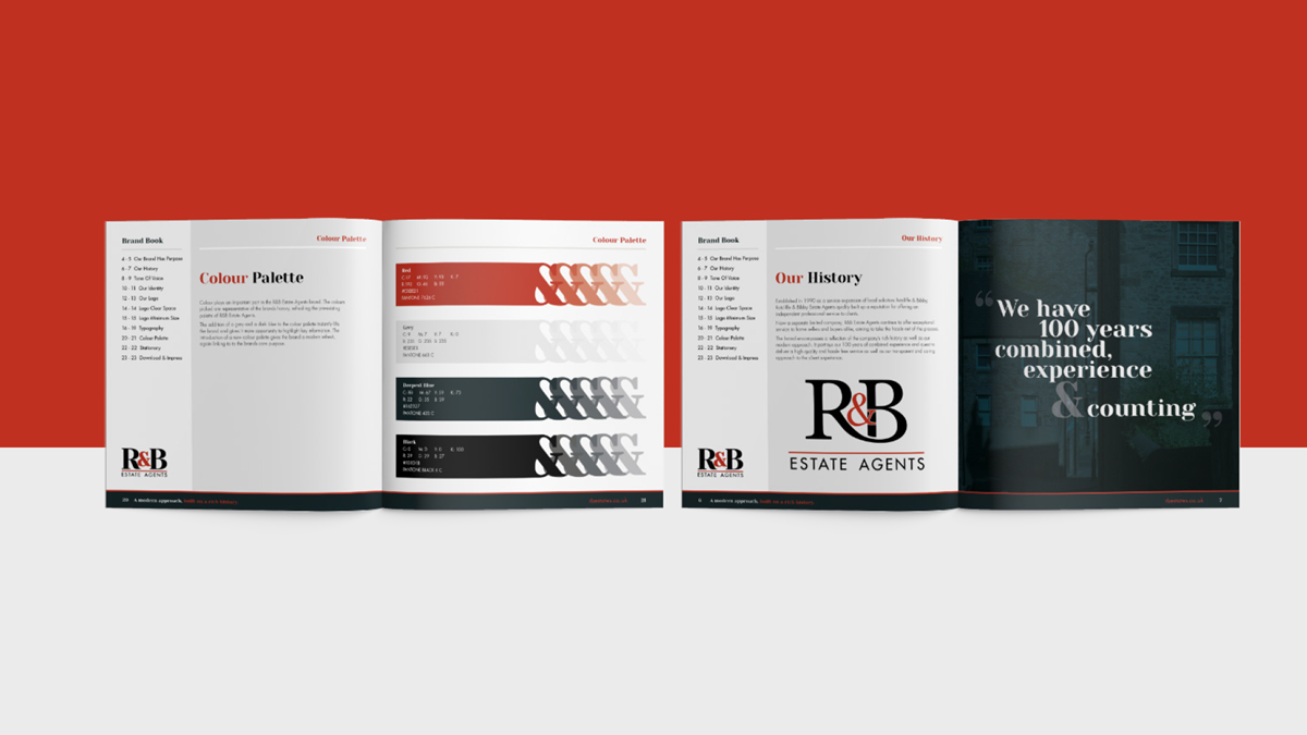
The brand now encompasses a reflection of the company’s rich history, as well as their modern approach. It portrays 100 years of combined experience and a quest to deliver a high quality and hassle-free service, as well as their transparent and caring approach to the client experience.
Strong modern typography is an evolution of the previous logo, whilst still being emanative of the brand’s original image. The tone of voice we developed reflects the reliable and personable ethos of the company. With lines such as “We are your Estate Agent,” R&B will instil a feeling of trust, honesty and transparency.
Colour plays an important part in the R&B Estate Agents brand. The colours picked are representative of the brand's history, refreshing the pre-existing palette of R&B. The addition of a grey and a dark blue instantly lifts the brand and gives it more opportunity to highlight key information. The introduction of a new colour palette gives the brand a modern refresh, again linking to the brand's core purpose.
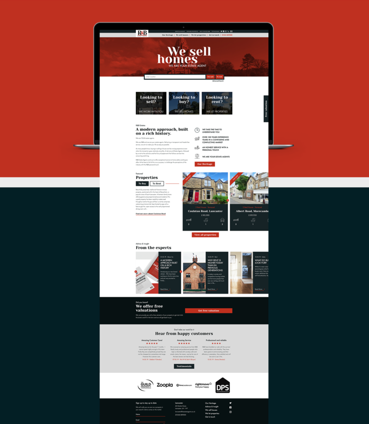
The website was designed to capture R&B Estate Agent’s expertise and care as well as their transparent and modern approach to the sales and lettings market. See the fresh new website here.

The Single Malt team are very proud of this project; it is fully representative of what R&B Estate Agent's stand for and will work towards creating a brand image that is synergistic with their combined 100 years of experience and top-class, hassle-free service.
“We initially contacted Single Malt to look at some offline design and marketing work for us. It quickly became apparent that the team at Single Malt inspired us to work through a branding refresh project.
From start to finish we were delighted with the work they undertook and even commissioned them to take on our new site, something we didn’t even plan on doing but are so glad we did. We wouldn’t hesitate to recommend Single Malt.”
LEE BRADBURY, R&B ESTATE AGENTS
We have loved working with the R&B Estate Agents team and are excited to see the brand continue to come to life, check out the full project page here.
If you are ready to develop your brand and want to see results, we are only a phone call away. We'd love to hear from you, let's get together, chat it through and see how we can help you.
Our contact details are here.
Enjoyed this? Read more from Single Malt Design LTD


