This article is part of our What We Learnt Spending $1 Million On Paid Ads Over 30 Days series. Check out the others HERE.
Let’s talk creative. As a video animation SaaS company, we’re pretty big on this – and not just because it’s the fun part. It’s also the most crucial element of any of our campaigns, which, when all the pieces fall into place, helps to transform a casual social media scroller into a hard cash customer.
So, take heed. Your creative needs to stand out, it needs to make sense and, ultimately, it needs to convert.
Over the last five years we’ve gotten pretty good at it. But it’s been a massive learning curve. We’ve tried lots of stuff – animations, drone footage, straight-forward face-to-camera. You name it, we’ve probably done it. We’ve even had one of our co-founders ‘run over by a car’…
The funny thing is that you never really know what’s going to work. That’s the thing with putting together creative: you can be happy that the output of your efforts looks good, but it’s almost impossible to say whether or not it’ll deliver on your objectives. What works for one audience, for instance, might not for another.
Figuring out the elixir of good creative isn’t easy. In fact, you might argue it’s impossible. But, in our honest opinion, we’re definitely closer to figuring it out (as best as anyone can).
Here are a few things we’ve learned.
The Evolution of Viddyoze
Our ads have changed dramatically since we first started advertising properly on Facebook in 2015. Back then we were more or less using a simple combination: a single image and a simple animation. These ads are almost unrecognizable to what we use now.
The key takeaway here is to keep pushing, to keep on being imaginative. Even if you strike gold, you can’t allow yourself to get too comfortable. What works extraordinarily well one day, might not the next. And you need to be prepared for that.
To make Facebook ads work, you need to constantly be in launch mode
Look at it this way. If you’re only ever posting cute dog gifs and suddenly cute dog gifs aren’t popular anymore – which will probably never happen, by the way – you’re stuck until you find something else. And time, as they say, is money.
To make Facebook ads work, you need to constantly be in launch mode. This means always being on your tiptoes and continually coming up with lots of new ideas.
That thinking cap never comes off.
The Formula
While there’s no secret formula for ‘good and effective video creative’, there is, you’ll be pleased to learn, a very simple structure that pretty much all the best ads follow. At the very least, it’s a good starting point.
It goes like this:
Propose a problem Emphasize that problem Reveal a solution (you and your offering) Encourage the viewer to take actionFor us, that roughly translates as:
“My videos are rubbish and I’m not getting enough customers!” “That’s why my business isn’t growing the way it should be.” “Hey, have you seen our super-easy-to-use software that will help you make cool video animations, attract customers and boost business growth?” “Buy Viddyoze now (and get an even greater deal)!”How you show that is the fun part. For a bit of inspiration, here are two of our best-performing ads ever. The first went live during ‘lockdown one’ and the second is pre-Covid-19.
If you’re making money from your ads, your creative is doing its job
The Only Metric That Counts
It’s very easy to get bogged down with metrics. To keep things simple, we only really focus on one. And that, no surprise, is sales.
If you’re making money from your ads, your creative is doing its job. Conversion is key here, which ties in with our previous section. Your creative needs to take a prospective customer on a journey, a journey that ultimately ends with them happily handing over their cash for your product or service.
Putting the thought in is what counts. Otherwise, what you’ll end up with is clickbait, content that has the power to draw people in en masse, but which ultimately disappoints. That gets you cheap clicks, but no sales.
Likewise, you can also spend time creating a long, in-depth ad that draws in fewer but highly engaged customers. But even that isn’t enough. Higher ad costs and some sales just don’t add up the way you want it to.
Where you want to be is somewhere in the middle – creating attention-grabbing content that hooks and converts the right prospects. Get that right and everyone goes home with a big smile on their face.
Finding Your Audience and Testing Everything
From the broad stuff, like interests (the kinds of things people like and engage with), right down to the ultra-granular sales stuff, such as the number of times a person adds something to their cart, it’s possible to target the right audience for your brand through Facebook (we will cover this in more detail in a later article as an FYI).
Testing those audiences is vital to the success of your creative
And testing those audiences is vital to the success of your creative. Really, it’s a bit of trial and error here. Broadly speaking, the number of audiences you can test will depend on your budget.
As a starting point, you may want to select between 5–10 audiences (based on interests and preferences). Once you’ve identified them, you can start to test variations of your creative – or different creatives – on them.
Here are some of the things that we’ve dabbled in:
Length: short, medium and long Style: serious and funny, animation led, and face-to-cam Subtitles: with and withoutIt’s an ongoing, resource-heavy and time-intensive endeavor. This is why we’ve invested in it, from hiring more people to work on ads to getting extremely organized in our workflow. So that means weekly meetings to discuss creative ideas and weekly shoots to bring them to life. And then uploaded, optimized and A/B tested. And so on.
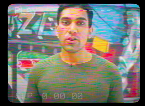
Right now, we’re finding that longer, face-to-cam videos are resonating with our audiences the most. By using co-founder Joey as our host, we’ve racked up over 700 million impressions to date. All in all, at the time of writing, some 150 million people have seen our ads all over the world.
So, for now, that’s what we’re continuing to roll with. Now, that doesn’t mean you should too. What is currently right for us might not be right for you. The point here is that it’s important to try new things and be adventurous. Because, as we’ve learned, that’s where the greatest rewards can be found.
Sometimes a piece of creative flops. Don’t be disheartened by this, it’s just part of the experience
Calling Time On Creative
Sometimes a piece of creative flops. Don’t be disheartened by this, it’s just part of the experience. Getting to the point where you realize this, that can be a little tricky. For example, knowing when to pull the plug can save you serious time and money. Likewise, there are times where you sometimes need to spend more to give the creative a chance to work. Figuring out when and how much is a delicate science.
For us, this is around £1,000. We find this gives us enough initial scope to see if the creative is working. So, if we hit that spending point and nothing really happens, we will, generally speaking, call time and move on.
For you, that amount will depend entirely on your budget. What we recommend is that you set a level you can afford and trial that for a while. As a rule of thumb, if your ad starts to make money, start spending more on it. If it doesn’t, then stop (that is after you’ve given it a chance to surprise you, like a boxer that has taken a hammering in the opening rounds finding his legs at around round six and landing a sweet knockout while he’s at it).
A Word On Thumbnails
Picture your Facebook feed. It’s busy. There’s a lot going on. Companies, friends, politicians and more all fighting for a microsecond of your attention. How do you stand out? The humble thumbnail.
This tiny image is the first bit of your creative that anyone will ever see – it needs to grab a person’s attention and stop them in their tracks
This tiny image is the first bit of your creative that anyone will ever see, so it needs to grab a person’s attention and, quite literally, stop them in their tracks. The idea is to create something that ‘looks real but not quite real’. An image that doesn’t quite make sense. For a split second, it captures someone’s attention long enough for them to subconsciously go “what?”.
Here’s how. Ramp up the saturation on the colors. Edit images so that they look hand-drawn. Have the person in your still look directly out of the screen. You’ll be surprised at just how effective these little tweaks can be. After all, we’re speaking from experience. These are just a few of the things that have worked for us.
Final Thoughts
If you take anything away from this guide to being creative, make it these three things. One, don’t be afraid to experiment with new ideas. Two, keep testing – you’ll eventually land on something that works. And three, have fun. This is the best bit, after all: making great content that makes everyone happy. And remember, you don’t need a big marketing budget to create great, clickable content that gets prospects converting. You just need imagination.


